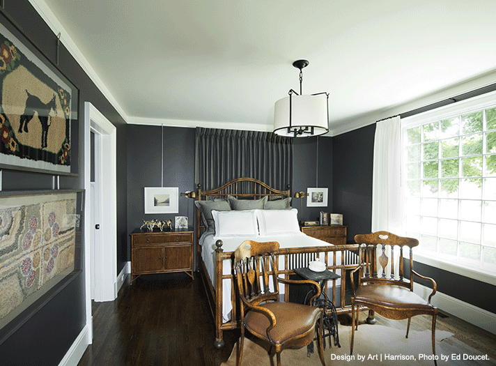
Have you ever wondered how designers create spaces in their own homes? We asked four exceptional professionals to share a personal project that they’re working on or have recently completed. Take a sneak peek into their imaginations…
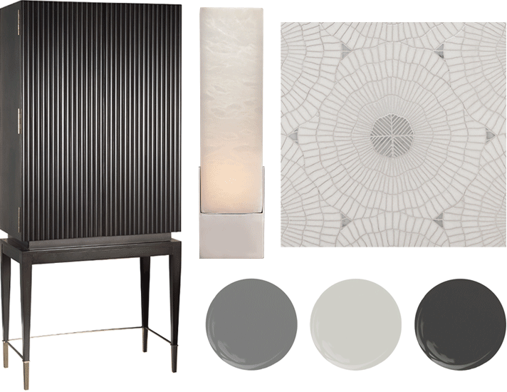
Available at MDC: CAI Designs bar cabinet, City Lights Detroit wall sconce, Ann Sacks floor tile, Sherwin-Williams paint.
LOWER LEVEL REDUX
“I’ve been steadily improving a modest Oak Park Bungalow I purchased two years ago. I originally bought the home as an investment opportunity, with the intention of living there for a couple years, fixing it up, and then potentially renting or selling it in the near future.
So far, I’ve worked extensively on the landscaping, remodeled the kitchen, replaced windows, doors, and light fixtures, and I gave the place a fresh coat of paint. Currently, I’m working on remodeling the lower level and the bathrooms. What you see above are some of my favorite pieces in the project so far.” – Amanda Sinistaj, Ellwood Interiors
AMANDA’S DESIGN TIPS:
- Know your budget. Understanding what your budget threshold is will keep expectations clear and allow you to make easier choices.
- Splurge if it means something to you. I have an oversized chandelier in a small kitchen nook, and it brings me joy every time I have coffee underneath it.
- Hire professionals. Scope creep can happen quickly. Having a professional on your side to help you plan, along with excellent craftsmen, will help keep the project on time and on budget without compromising on quality.
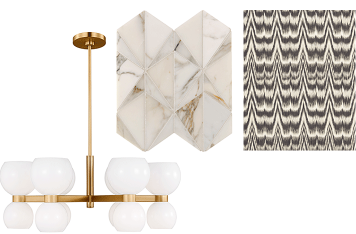
Available at MDC: City Lights Detroit, lighting; Ann Sacks backsplash tile; Schumacher Roman shade fabric.
BYE-BYE 1990S
“In the summer of 2022, we bought a classic 1940s Georgian Colonial and immediately set to planning renovations that would make it a perfect family house for our five-year-old twins. Two years in, we find ourselves in the process of a full kitchen renovation. The 90s remodel was gutted, including light brown and lilac linoleum and black laminate countertops. The new space will be a bright, family-centered space that will maximize the existing footprint and add storage.
In my sneak peek above, we have a beautiful backsplash tile with a pattern and colorway that has a modern shape with a beautiful neutral-based dimensional appeal. The elegant light fixture features a burnished brass finish and milk-white glass globes that create soft ambient lighting and makes the kitchen feel more inviting. Finally, we have a Roman shade valance that not only provides great acoustic value and privacy for the space, but the fabric’s print also adds interest in a color that offers the visual weight needed to balance other built-in elements in the space.” – Cynthia Hahn, GHK Design Collaborative
CYNTHIA’S DESIGN TIPS:
- Although the final aesthetic is what you see, the true design for a kitchen is behind the finishes and final touches – it’s in the function. Don’t jump to tile, countertops, and cabinetry, until you’ve taken the time to define how the layout of the space will support the day-to-day function and store all the essentials of your daily routine – right down to the final teaspoon!
- To keep a busy family organized, add a message board, and gadget charging center in a visible spot that is also tucked away from the main work areas. To keep the flow of our kitchen moving, we added a small Butler’s area that houses the family calendar, small Post-it pads for quick notes, writing tools, and a lower cabinet outfitted with outlets and USB ports to create a hidden device-charging station.
- For smaller kitchens, opt for lighter colors overall to avoid making the space feel closed-in and uninviting. You can still bring in color with soft shades of your favorite hues on kitchen cabinets and walls. To visually expand the space, consider running upper cabinets to the ceiling to visually heighten the space.
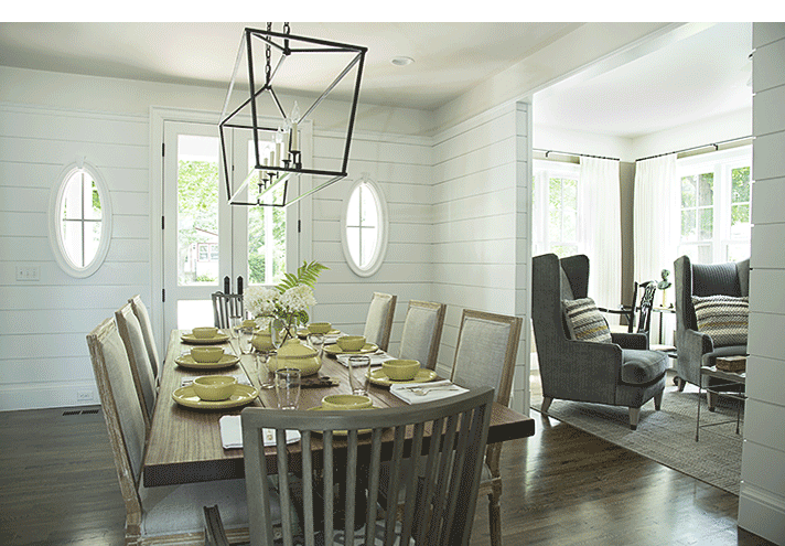
Photography by Ed Doucet
CURATED COTTAGE
“This is my 1860s cottage in Douglas, MI that I completely renovated down to the studs. My design partner Art Sanchez and I thoughtfully curated this project by adding modern elements and finishes while also paying tribute to the original vintage charm of the home.” – Barry Harrison, Art | Harrison Interiors
BARRY AND ART’S DESIGN TIPS:
- The best part about capturing a designer’s personal interior design project is their willingness to think outside the box and to try something different. For example, there are several of Barry’s personal art and DIY projects that were completed to help bring this house to life and make it his own.
- Would you ever guess that the dining room is also the foyer of the house? A good design not only looks nice, but also has a carefully considered floor plan with thought-out space planning. You can make the best use of a small space by using this trick.
- A designer wears many hats and is not afraid to get hands-on in the design process. Barry used his background of woodworking and sculpture to create the custom oval windows you see in the dining area. This charming element acted as a focal point not only to the front entrance but added natural light to this space.
- A space is not complete without accessories. Many people think décor is just pretty objects. A good design has accessories that are significant, and maybe they are useful or have a personal meaning. The two framed art pieces you see on the wall in the primary bedroom are rugs that have been in my family for generations. This design trick not only added visual interest to the space, but also displayed something special.
Available at MDC: (Primary Bedroom) Baker | McGuire bed and nightstands, CAI Designs chairs, City Lights Detroit chandelier, Tennant & Associates drapery fabric. (Living Room) CAI Designs highbacked chairs, Flooring Designs Distributors area rug, Baker | McGuire black armchair, Tennant & Associates pillows and sheer drapery fabric. (Dining Room) City Lights Detroit chandelier, Baker | McGuire host chairs.
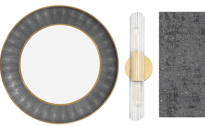
Available at MDC: CAI Designs mirror, Lighting Resource Studio vanity light, Tenant & Associates wall covering.
POWER TO THE POWDER ROOM
“I have a small powder room with three angled walls, making for an interesting shape. It has a typical beige pedestal sink, a toilet, one light fixture and a mirror—not very exciting! I am designing a custom vanity to give us some much-needed counter space, using a wallcovering for texture, and improving the lighting situation.” – Joanne Ledbetter, Joanne Ledbetter Designs
JOANNE’S DESIGN TIPS:
- Often, it’s the smaller spaces that prove to be most challenging, especially a bathroom. Function is the priority here, so the plumbing is very important—but don’t forget about aesthetics. In this case, beauty really is in the details.
- Say yes to rich colors and patterns, unique lighting, and mirrors. And never place a toilet so it’s visible from the hallway. A designer can help you take a bland, ordinary space and turn it into something unique.
