Last month we highlighted Nouveau Neutrals, and now we’re moving on to color, color, and more color! We reached out to four interior design mavens to give us the ins and outs of color coordination and to help give our spaces a glow up.
Photography by Sally Matak
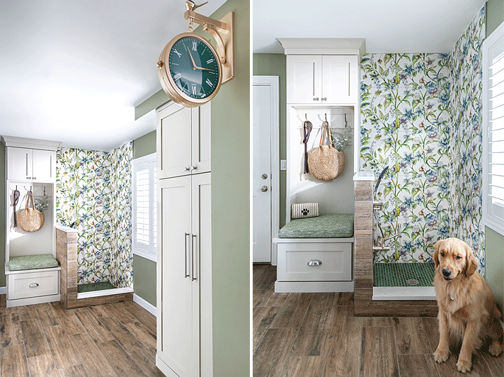
BOTANICAL BEAUTY
“I knew from the beginning that this dog wash/mudroom called for a colorful and whimsical design that reflects the homeowner’s ebullient personality. A place where even the family dog would feel like a king. We started with the floral tile as inspiration; incorporating the client’s favorite color green and selected neutral cabinets which allows the botanical design to be the main feature in the room. The dark green wall clock and tiles bookend the room to coordinate the theme and act as a supporting color. I love to layer texture as seen in the organic floral tile, large green penny rounds, and performance fabric cushion. And how about the fun bird sitting on top of the wall clock?” — Ruth Casper, Ruth Casper Design Studio
RUTH’S COLOR TIPS:
- First, don’t be afraid to use color. If you have a bold personality—go for it! Room saturation is popular where you paint the ceiling, walls, and trim all the same color. This can create a big statement in your home.
- If you’re just beginning to incorporate color into your space, start small. Update your rugs, pillows, or coffee table accessories. Adding colorful trim to a window treatment can be an elevated way to add color as well.
- Want something fun? Put color on your ceiling. Don’t forget about the fifth wall. Adding ceiling wallpaper with color and texture can be the main feature in a room.
Available at MDC: Pindler bench cushion fabric, Resource Center Benjamin Moore Louisburg Green wall paint
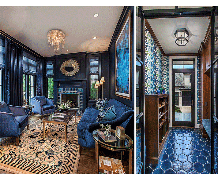
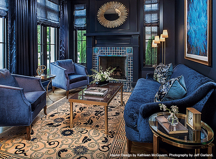
Photography by Jeff Garland
ROYAL RESIDENCE
“This was a new-build residence with a semi-open floorplan that required careful color consideration to ensure proper flow throughout the home. The parlor is the opening act as you enter the first floor, with a stunning five-foot mixed media piece by artist Lenore Gimpert immediately drawing you in. It was critical that all the other spaces, including the kitchen, dining room, and rear entrance/mudroom (pictured right) were in harmony with the Benjamin Moore Dark Royal wall color. This was executed by connecting each room with important architectural material such as the Pewabic fireplace tile in the parlor, the backsplash and upholstery in the kitchen, and the floor tile in the rear entrance/mudroom. The parlor is mysterious and sexy, but strong and dignified—perfect for intimate entertaining as requested by the homeowner.” — Kathleen McGovern, Kathleen McGovern Studio of Interior Design
KATHLEEN’S COLOR TIPS:
- When working with color, it’s important to consider the finish. Because we were using light-reflective and metallic furniture and window treatments, a matte finish paint was applied to the walls. The mantle and crown molding were painted with a high gloss finish, highlighting the surrounding surfaces. By selecting one unifying color, a monochromatic envelope can be created that provides a cozy, inviting setting.
- A color, even a bold color, won’t be overpowering as long as it’s balanced throughout the space. A bold space doesn’t always require a striking background, but it does demand a consistent balance or weight in the furnishings, be they a combination of solids, florals, stripes, or plaids.
- Your eye needs a break to appreciate a carefully curated room. In our midnight parlor, we provided that relief by topping the dark walls with a white ceiling and using a complementary color in an antique rug.
Available at MDC: CAI Designs sofa and club chairs; Rozmallin sofa, chair, pillow, welt, and window side panel fabric; City Lights Detroit floor lamp; Resource Center Pewabic fireplace tile; Lighting Resource Studio fireplace mirror; TRA Art Group fine art; Kravet Roman shade fabric; Decoroom window decorative trim.
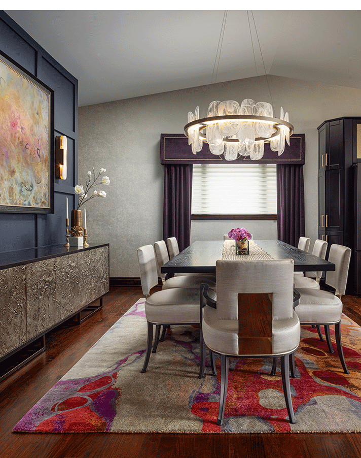
Photography by Brett Mountain
KALEIDOSCOPIC CHIC
“Knowing the value of investing in their home, my clients Kris and Russ have put a lot of work into their Fenton residence over the years. Now that they are becoming empty nesters, they realized that their home no longer matches their style, and it was time for a refresh. It was important that the dining room was as beautiful as it was functional for hosting holidays, family dinners, and summer get-togethers.
Kris has never shied away from bold décor and color, and the dining room was the perfect opportunity to make a statement while maintaining a warm, welcoming atmosphere. A traditional china cabinet was replaced with a streamlined credenza, and custom millwork was added to the space, placing the existing artwork center stage. A custom runner and orchid centerpiece sit atop a new furniture set that also feels like it was destined for this home.” — Rachel Nelson, Concetti
RACHEL’S COLOR TIPS:
- I think it all starts with understanding which colors YOU love. Notice the colors that you gravitate toward, and which colors inspire you. You can even look through inspirational images to see which colors you enjoy in certain spaces. For example, I’ve LOVED peacock colors ever since I saw one at the zoo as a little girl. Now, my living room encapsulates a full peacock color palette. I even have a big chartreuse sectional and I love it.
- In terms of rules and the notion of what you should do…get rid of those “rules” and “shoulds” and instead focus on things that are in alignment with who you are. Some people believe that small spaces must use light colors, but that isn’t true. Painting a small room a dark color can actually make it feel bigger because dark colors create depth. Likewise, painting the walls and ceiling the same color can have the same effect.
- My biggest tip for pulling color into your space is to do so through paint. It’s an easy and inexpensive way to incorporate color into your space, especially if you already have existing furniture. Another way to add color is with rugs, pillows, and other accessories. Wallpaper is also a great opportunity to create a statement through color and pattern.
Available at MDC: CAI Designs dining chairs and dining room light, Tennant & Associates dining table runner fabric, cornice, and stationary panels, City Lights Detroit sconces.
(left) Photography by Laura McCaffery. (right) Photography by Way Up Media.
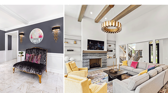
COLOR BOMBS
“The first home (left) is in Grosse Pointe Farms and the clients were looking for a space that evoked the feeling of entering a fine hotel. Specifically, they wanted seating that was tall, colorful, and dramatic. I found this modern, French-inspired settee with a generous back height and cabriole legs. With a nod to the glamorous gold finishes that carry throughout the home, we did the frame in a luxe gold finish. The opulent raspberry velvet pillow fabric along with the body of the settee in a black and gray velvet print, are perfectly finished with circular pink and gray abstract art in this welcoming vignette.
The clients who reside in the downtown Rochester home (pictured right) host large family gatherings and need ample seating. She asked for a neutral palette, but when we spotted a beautiful selection of multi-colored velvet fabrics, it was very hard to resist using a variety of them for pillows. Then came the rug choice. An all-gray neutral approach lost out once again to a more dynamic area rug with energetic pops of color. The final decision included two chairs clad in a fabulous citrus-hued, textural velvet. The overall space is still conservative in color, but not too sedate. I call the gorgeous splashes, ‘color bombs.’ Wow!” — Terry Ellis, Room Service Interior Design
TERRY’S COLOR TIPS:
- I fully endorse using a neutral color for larger pieces in a space and accenting with eye-catching colors. Pillows and art are the simplest ways to do this. I think it can be super fun to create a room saturated in bold colors. But for most clients, there are often practical considerations. Committing to a wide range of bold colors can be too much, particularly if they like to change some of the components every few years.
- Recognize that metals and woods act as colors and add to the palette of a room. For example, gold hardware or light fixtures bring yellow to the mix, and a honey oak wood floor brings an amber/orange color to the overall palette.
- If you're working with a primarily neutral room, distribute and repeat the accent colors at various locations in the space.
Available at MDC: (Foyer) Lighting Resource Studio foyer wall sconces; Kravet pillow fabric; (Living Room) Pindler pillow fabric; CAI Designs recliners, sectional, and coffee table; The Ghiordes Knot rug.