Much like the way a perfect pair of shoes and fantastic jewelry complete an outfit, interiors require impeccable finishing touches to personalize and complete a space. Read on to see what some of the best in the interior design biz have to say about giving your home a refined look.

Photography by Brett Mountain
KIDDIE CORNER
“This was a new construction project for a young family with three children. When styling the finishing touches, it was all about WHO we were designing for. It was really important to create dedicated spaces for the children that still blended with the aesthetic of the home. Even though this is a space reserved for little ones, the décor needn’t be cliché. You can be strategic and intentional with the selection of kid’s items so that they blend into your décor, without it appearing to be an afterthought. But kids will be kids, so prepare for some thoughtful storage solutions to tuck away those must-have toys that don't fit within the overall look.” – Taylor Morgan, Concetti
TAYLOR’S TIP:
My favorite finishing touches are plants, plants, and more plants! It’s the easiest and best way to bring literal LIFE into your space.

Photograph by Gene Meadows
SCULPTURAL SNEAK ATTACK!
“Previously, the entry of this home was simply a narrow multi-colored walkway. To elevate the space, we started by concealing a closet door and the wall above with 3-D Medium Density Fibreboard (MDF) which transformed the area into an art feature. A new curved wall replaced an underutilized dining room niche adding space, and the climbing sculpture adds a whimsical touch.” – Diane Hancock, Diane Hancock Designs
DIANE’S TIP:
To finish a space, I like to check a couple of boxes: textured and functional items, as well as layers. Aside from the primary pieces of furniture, you need to develop balance through curated items like plants, accessories, and artwork. It takes a village so to speak. One of the easiest ways is to find an oversized art piece, preferably something original and not mass produced. It can really bring a room together quickly.

Photograph by Texture Photography
RUNNING A FOWL
“The client for this project loves hardware details! In fact, we selected her plumbing, lighting, and cabinet hardware before anything else. This powder room is nestled inside a Michigan lake house and the swan faucet is a nod to the wildlife they see daily. I consider a home’s finishing touches to be a reflection of the owner’s personality and should provide a sense of wellbeing.” – Dawn Jacobs, Artichoke Interiors
DAWN’S TIP:
Start with a main inspiration piece, whether it’s artwork, a rug, or favorite color. Build from here. It’s important that you have a starting point to serve as your framework.
My favorite final touch is great lighting. It’s like finishing an outfit with a piece of jewelry – one that can change the entire direction of the look and should never be ignored.

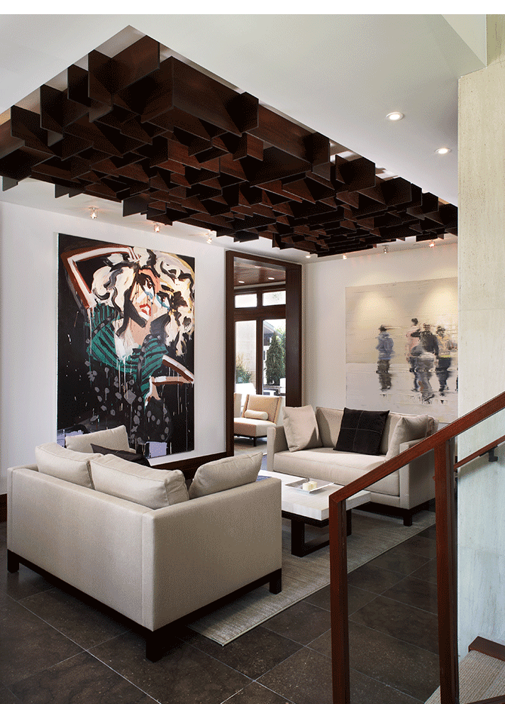
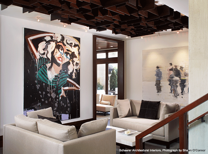
Photograph by Shawn O’Connor
CROWNING GLORY
“This sitting area is inside the ground level entrance of our client’s bachelor retreat. The incredible ceiling serves as a giant light fixture and is a great example of how fine millwork can transform a space. Nearby stairs lead to a second floor living room with expansive views.” – Bob Schaerer, Schaerer Architextural Interiors
BOB’S TIP:
When using simple non-patterned fabrics and finishes, be sure to use high levels of color contrast to create interest.

Photograph by Jeff Garland
FINER POINTS
“Scale and prominence are important to consider when deciding on items that take a supporting role in a space. The small footprint of the powder room in this Georgian-style home is perfect to showcase the jewelry box-like details curated for this area. The English vitreous China and nickel plumbing, diminutive sconces, and crystal chandelier were all selected for their elegance and their important scale within the room's predetermined architecture. A larger space would have provided a canvas too spacious to punctuate the delicate scale and details of the furnishings.” – Kathleen McGovern, Kathleen McGovern Studio of Interior Design
KATHLEEN’S TIP:
Regardless of size, we consider carefully curated art to be the most important detail that can be added to any room. For example, “Red Poppies” by local artist Lenore Gimpert, was the final and most dramatic detail planned for the room. Its blazing red color and its placement over the loo provide an impactful visit for the guest.
