The cornerstone to design, efficient space planning isn’t always ubiquitous in a home. We asked four design aces to share their best space planning solutions for every room in the house.
Photography by Martin Vecchio
CLEARLY DEFINED
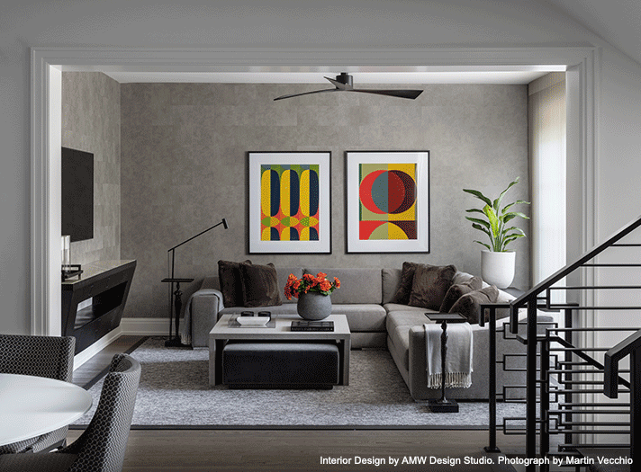
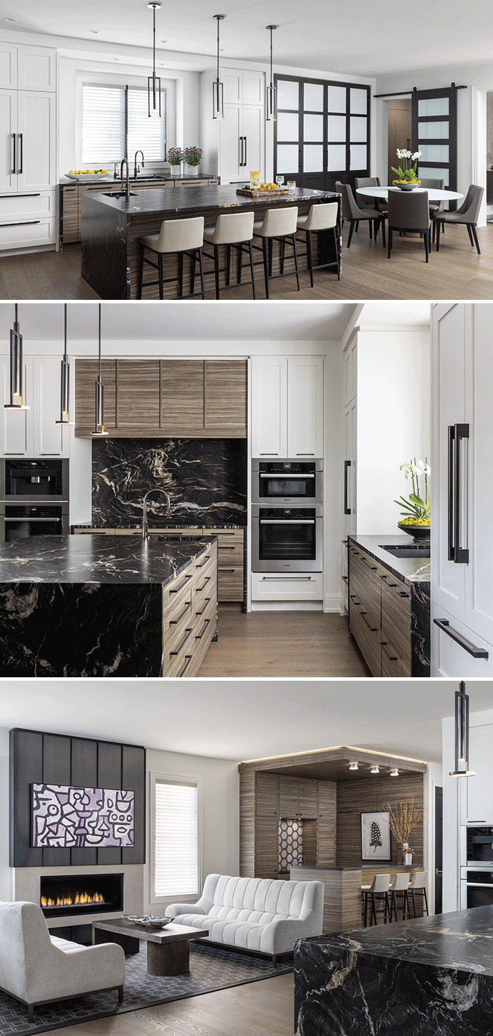
“The clients in this Birmingham home requested a warm, contemporary design, so furnishings were selected with that in mind. Comfortable upholstery and luxurious fabrics are key elements in creating a nest-like atmosphere. An open plan with clearly defined spaces gave this compact home a bigger impression. There was a big effort to keep furnishings minimal and properly sized so that valuable space could be maximized.
The entertaining space, which includes the kitchen, dining area, bar, and sitting area exist as one; whereas, the family room is visually conntected to the other spaces, but because of its location, feels more private. A neutral and consistent color palette successfully brings all the spaces together.” — Amy Miller Weinstein, AMW Design Studio
AMY’S SPACE-PLANNING TIPS:
- Always create a scaled drawing of your space. Dimensions are the “Holy Grail” for successfully planning a space.
- For a clean, well-conceived space, consider using less furniture and avoid unnecessary "filler" items.
- Don't overlook the ceiling height and the windows when creating an atmosphere. They are important! You can expand a space with lower ceilings and smallish windows with visual tricks and conversely, you can cozy up a large open space with expanses of glass using different visual tricks.
Available at MDC: Dining Area: Designer Group Collection table and chairs; Tennant & Associates chair upholstery. Bar and Sitting Area: CAI Designs coffee table; Beaver Tile & Stone niche tile. Family Room: Designer Group Collection sectional sofa; Designer Furniture Services + Fabrics custom parsons table and ottoman; Pindler pillow fabric.
Photography by Jim Haefner
MULTI USE
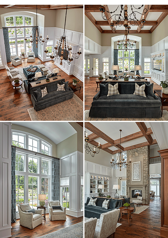
“Space planning was the hardest part of designing this room for my Bloomfield Hills clients. I had to independently think through all the different ways this room would be used. In its most simplistic form, it’s one large room. But really, it’s a formal living room, bar for entertaining guests, family room for watching TV, and a great room that connects to the kitchen.
In addition to all its different uses, I was challenged by the space’s many points of entry, and the double-sided fireplace that floats between the dining room, hallway, and living room. Using a subtle hierarchy of finishes (and some Trompe-l'œil) I was able to create zones in the room. Custom coffered beams span the width and length of the room, while two large chandeliers and a pair of matching rugs quietly divide the space into two halves, creating a formal living room and informal family room.” — Megan Runsat, Young & Young Interiors
MEGAN’S SPACE-PLANNING TIPS:
- Make a list of all your desired needs for the new space. How would you like this room to function? What’s currently working and not working?
- Think about walkways and how you will move around the space. You’ll need a 36-inch minimum for main walkways and a 30-inch minimum for secondary walkways.
- Consider how your room’s architecture, lighting, or rugs can be utilized to divide a space in subtle ways.
Available at MDC: The Ghiordes Knot rugs; Schumacher sofa fabric; Tennant & Associates sofa pillow fabric; City Lights Detroit table lamps; Rozmallin drapery fabric; Designer Furniture Services + Fabrics upholstery; Alexandra June accessories; Kravet/ Lee Jofa/ Brunschwig & Fils accessories; Lighting Resource Studio accessories; CAI Designs lounge chairs and side table.
Photography by Matteo Morrison
KID ZONE
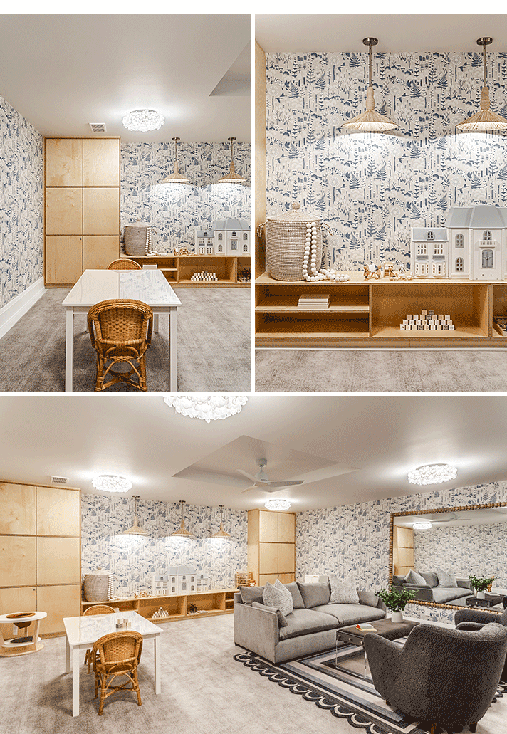
“My client wanted the design of this playroom to feel sophisticated and flow with the rest of the spaces in their Birmingham home. It needed different areas to serve different functions: sufficient and nice looking open/closed toy storage, a low, long bench/table where kids could play with their toys, an arts & crafts area, kitchen area, enough open space for free play, and a comfortable, soft seating area where both adults and kids could curl up and read or watch movies. An area rug helped define the adult seating area.
A long wall of custom storage was designed to fit very specific items, toys, and books. Although it does contain a small amount of lower, open areas of storage, most of the toys are able to be tucked away behind closed doors making it more aesthetically pleasing. The design challenge was finding a color palette that increased the brightness of the room because the space lacks windows or natural light. Ample overhead light, bright colors, lighter wood finishes, and joyful wallpaper helped. Overall, the mood of the room is light and playful, but still sophisticated and elegant.” — Anna Versaci, Anna Versaci Design
ANNA’S SPACE-PLANNING TIPS:
- Always draw out the space to scale and organize the room into separate areas that serve different functions. You can use area rugs to define spaces within a room.
- When it comes to closet/storage organization, take an inventory of the exact items you need to store. Measure them and use those measurements to define the height of the shelves or the cabinets, etc. Measuring is everything.
- Resist the urge to push all the furniture and shelving against a wall. This creates a dance floor effect, and wastes space in the center of the room. Don't be afraid to float furniture or use creative partitions like bifold screens to create partial walls for definition.
Available at MDC: Schumacher wallpaper; CAI Designs lighting and furniture; Pindler fabric.
FULLY FUNCTIONAL
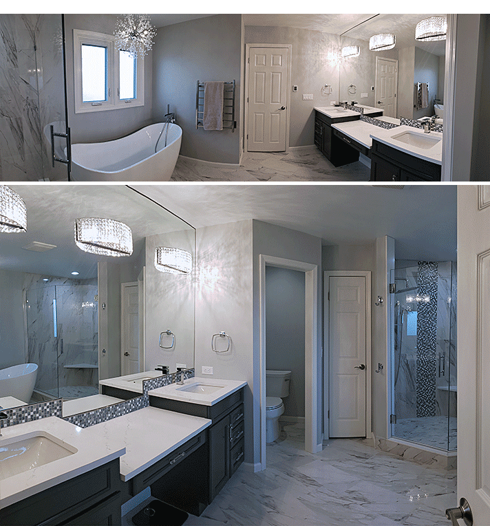
“The space in this Bloomfield Hills home was originally outdated, crowded, and not user-friendly for the client. The former design had a large garden tub that was never utilized, lacked seated space for make-up application, had dim lighting, and didn’t utilize of all the available space. To free up more wall space, the closet point of entry was relocated outside of the bathroom, which really opened design flow opportunities. The sinks were relocated from where the toilet and closet currently sit. By doing this, we were able to make the space feel brighter and airier. The new design includes a private water closet, small linen closet, a larger shower, a free-standing tub, and ample lighting. Space-saving features include a quartz corner bench and corner shelving to give the shower an open and airy feel. The new changes really make the best use of the space for the homeowner.” — Jennifer Kasselmann, Art by Design Interiors
JENNIFER’S SPACE-PLANNING TIPS:
- Form vs. Function - It may look pretty, but is the space functional to the end user? A space cannot be functional if navigation is a hassle.
- Pay attention to scale and proportion. Using furniture that is too large or too small for the space can make the room feel unbalanced and uncomfortable.
- Do not push all the furniture up against the walls. Homeowners tend to do this to make their rooms feel bigger, when in fact it can make the room feel disconnected and unwelcoming. Even pulling furniture pieces away from the walls by a few inches can have a big impact in your room.
- Maximize lighting in the space. Add additional windows if the budget allows or try layering light sources (with dimmable switches) to achieve the desired level of brightness.
Available at MDC: Lighting Resource Studio lighting; Ann Sacks sinks and toilet.
