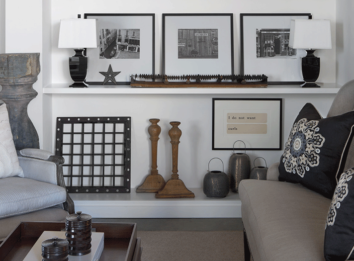
Ideally, shelves should bring clarity and order to a space. But too often they become a repository for random knick-knacks, clutter, and out-of-scale items. Balancing creativity with practicality, designers know how to maximize shelf space and make it look attractive. In November, designers Shelley Knudson and Kali Weber led a Launch! tour at MDC on “How to Style Shelves Like an Interior Designer.” Learn what advice they offered, along with tips from three other fine designers, including Jimmy Angell, whose work is pictured.
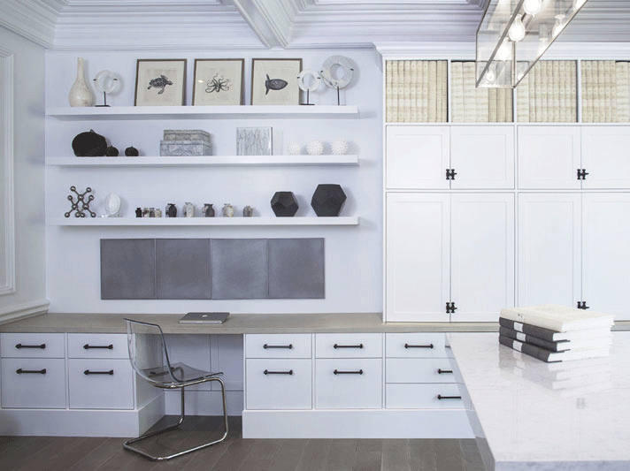
This home office designed by Rariden Schumacher Mio used floating shelves to display items. Photo by Michael Raffin
“We worked with a few of our client’s existing accessories, adding items that would accentuate and balance the pieces they already owned,” Michelle Mio, of Rariden Schumacher Mio & Co., says about this home office. “We decided on a monochromatic color palette so that no single item would stand out as being more important than the others.” Michelle offers these tips about styling shelves:
- Create interesting collections that incorporate the balance of shape, scale, and color.
- Don’t forget that stacking books horizontally, especially large coffee-table books, fill up space and create visual interest.
- In the end, “You do you!” Find your own style with items that are meaningful to you.
Michelle also adds a few cautionary notes about styling shelves. “Accessories can seem ‘hodgepodged’ together with no thought of how they work together as a whole. Also, there is such a thing as ‘over-accessorizing.’ Using too many items will seem messy and cluttered.”
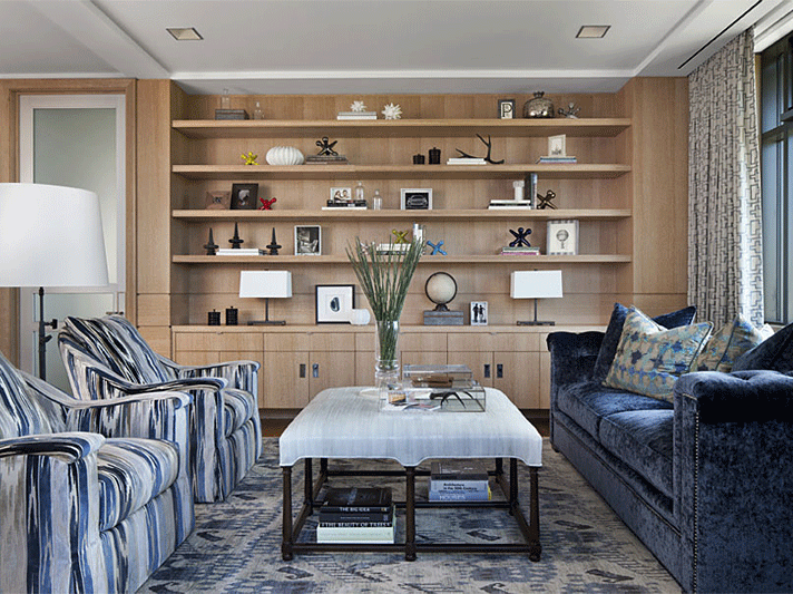
Jimmy Angell created what he calls “visual rhythm” to this shelving space. Photo by Beth Singer
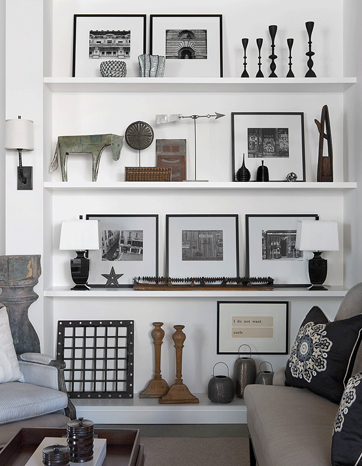
Art, photography, and rustic artifacts bring visual appeal in this display by Jimmy Angell. Photo by Beth Singer
Avoid placing objects willy-nilly on shelves, suggests Jimmy Angell, principal of James Douglas Interiors in Birmingham. Instead, he advises careful consideration about what to put where. “Creating visual rhythm enhances the display,” he says, while also urging people to “feature objects that mean something.” Jimmy suggests leaning artwork to help fill vertical space and contrasting objects with their backgrounds to highlight the silhouettes of accessories. In short, think about placement and space – but don’t obsess about it. “Just play, and enjoy the process,” he says. And, for freshness and variety, he offers an easy tip: “Rotate your finds quarterly.”
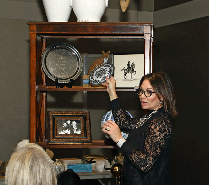
Kali Weber shows how adding light-colored vases and a blue-and-white jar can offset a dark shelf. Photo by Jeff Aisen
In their Launch! tour presentation on Nov. 18, designers Shelley Knudson and Kali Weber, owners of Chatham House Lifestyle Gallery at Michigan Design Center, offered shelving style tips before a group in MDC’s Mid-America Room. Shelley and Kali showed several ways to design a traditional bookcase and a more contemporary one. Regardless of your style preference, there are some design tips that apply across the board. To add texture and visual interest, the designers recommend wallpaper behind bookshelves. If the built-in shelves are white, consider painting them, or covering them in lacquer. The designers both strongly suggest adding accessories that have a personal meaning. “Randomly buying accessories to fill up a shelf has the cold look of a catalogue,” Shelley says.
Their other pointers include:
- Consider grouping a collection, such as ginger jars, or vases, on shelves.
- When using color, use a uniform palette.
- For variety, place books both horizontally (especially coffee-table books) and vertically.
- For contrast, add white or brightly colored items to a dark shelf.
- Be creative. Instead of bookends, try using an antique urn or a small doorstop.
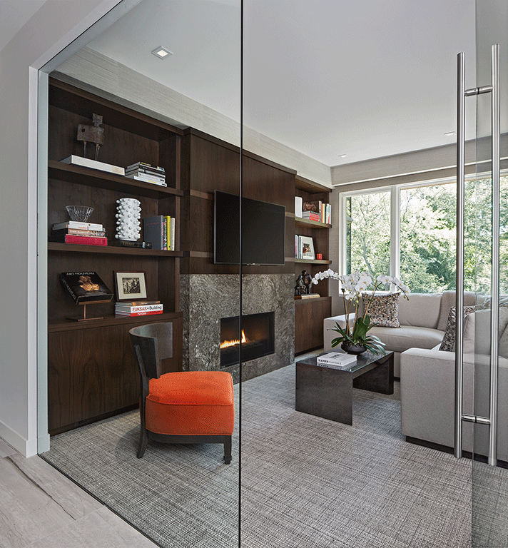
Symmetry and a clean, uncluttered look are hallmarks of this space designed by Ann-Marie Anton. Photo by Beth Singer
Ann-Marie Anton, principal of It’s Personal Design in Grosse Pointe, suggests starting with a clean slate before displaying accessories on the shelf. “Empty all the shelves and put all the items you are working with together on a table so you can see what your options are,” she says. “Start with the larger objects. You’ll want to keep the larger accessories dispersed on the shelves and you can later fill in spaces with smaller items, keeping balance in mind. Just keep moving the pieces around until it feels harmonious.”
Ann-Marie offers a few other recommendations:
- Keep negative space in mind, which is the space around an object. See how the items on the shelves interact with one another to avoid a cluttered look.
- Keep it straight. I prefer to keep items displayed straight versus on an angle to maintain symmetry and balance.
- Be creative with books; don’t feel compelled to line them up in a row. Displaying books in different ways creates a more interesting display.
