These bright accent colors are full of personality and aren’t satisfied playing the supporting role in a space. Four talented designers share their thoughts on incorporating color that will elevate your mood without overwhelming your senses. They also have a few tips and tricks up their sleeves to keep those charismatic color stars from becoming drama queens.

Velvet fabrics add warmth to this space and the vivacious strokes of green add a touch of biophilic ambiance. Photos by Beth Singer
Colorful Conversation
“We wanted to modernize the dated baby blues in the living room and give it a pop of color as this area is the first thing you see upon entering the home. The vibrant greenery outside the bay window served as inspiration for the bold green fabric choice on the sofa. A beautiful striped section in the center of the sofa pulls in the colors from the artwork and was created for the resident’s dog to peer out the window. Now the space is fun and has an unexpected conversation piece.” – Rita O’Brien, Rita O’Brien Interiors
RITA’S TIPS:
- Less is more when it comes to designing with color. Keep the surrounding walls a neutral palate enclosing the vibrant color – it makes a statement and keeps the space from getting too busy.
- Incorporate accessories that share the same color as your statement piece.
- Use recessed lighting with dimmers in your space. It sets the mood for all colors.
SOURCES:
Sofa, ottoman, and chair: Rita O’Brien Interiors
Area rug: The Ghiordes Knot
Alternate view: Console table: Schumacher

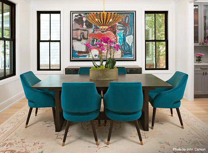
Seated in a new-build farmhouse-style home, this table and teal chairs add a clean, modern touch to the diningroom. Photo by John Carlson
New Build Done Bright
“This is a simple modern farmhouse and we wanted to take the dining room up a notch to make it vibrant. The design started with a cool vintage rug which has hot orange, pink, and teal thread accents, so I pulled the teal thread out and incorporated the color into these chairs. The homeowners are a young couple and regarded this house to be a steppingstone which gave me flexibility when it came to the design. I think they were willing to be more playful knowing that this isn’t the house they will be in long term.” – Heather Duggan, Heather Duggan Interiors
HEATHER’S TIPS:
- Start with one piece that you love for inspiration. In our situation, we used the rug, but perhaps you adore a particular pillow fabric in your own home.
- Roll with one or two colors throughout the design and choose complementary colors, not contrasting colors. In this dining room, layers of color were not needed because there was enough personality with the teal.
- I consider art to be in its own category, so it doesn’t have to match the color scheme. The design was fun and happy, and this piece of art reflected that.
SOURCES:
Chandelier: Available through City Lights Detroit

Mixing scale and pattern, tied together by color, creates a harmonious design with commanding effect. Photo by Hayden Stinebaugh
Sandy Foundation
“A soft, sandy white color was used on the walls, carpeting, and upholstery to create a more monochromatic feel for this project. The pattern of the drapery gave movement and injected color in the space, along with the blue stripe fabric that was used on a repurposed antique chair.” – Cynthia Evans, Cynthia Evans Interiors
CYNTHIA’S TIPS:
- The choice of color is so important. It should be a color that evokes emotion and is not necessarily just a trend. Often, using larger scale on smaller pieces such as the wide stripe fabric on a smaller scale accent chair has a dramatic effect.
- Accents of color are often best with a more monochromatic color scheme to create contrast and intensity of color.
- Select a color that resonates with you, and choose accent pieces such as pillows, art, or furniture to highlight that hue.
SOURCES:
Drapery fabric: Rozmallin
Chair fabric: Kravet/Lee Jofa/Brunschwig & Fils
Sofa fabric: Pindler

A spectacular herringbone tile feature, supported by coordinating accents, sings in this space. Photo by Jeff Garland Photography
Tide Turning Tile
“This was the primary color in the palette that was used throughout the entire first level of this home and the color really spoke to us. The watery tones and the strength of the color provided a happy, relaxing but sophisticated feeling throughout—much like the personalities of the homeowners!” – Kathleen McGovern, Kathleen McGovern Studio of Interior Design
KATHLEEN’S TIPS:
- Using a bold tile color in a white kitchen is a great way to bring personality to the space. The wood countertop on the island provides the warmth of a wood table and is a contrast to the coolness of the tile and quartz countertops throughout the rest of the kitchen.
- Adding a colorful fabric as a window treatment gives your eye some necessary relief from the all-white cabinetry.
- By eliminating the cabinet backs, the glass cabinetry allows for the colorful tile installation to be uninterrupted and provides a strong contrast wall.
SOURCES:
Lighting: City Lights Detroit (Visual Comfort)
Window Treatment: Schumacher (Pattern: Darya Ikat in Color: Sky)
Counter Stools: CAI (Bailey Counter Stools by Bernhardt Interiors)
Counter Stool’s Fabric: Kravet/Lee Jofa/Brunschwig & Fils (Pattern: Tailor Made in Indigo)
Counter Stool’s Trim: Tennant & Associates (Samuel & Sons Leather Piping in Indigo)
Hall Bench: Rozmallin (Fabric: Osborne & Little; Pattern: Westray; Color: 26)
