If you’ve been decorating your home under the impression that all design elements need to match, you’ve been missing out. Some of the most stunning spaces are ones that incorporate many different design styles; however, it is possible to overdo it. Read about how a few of the area’s top designers seamlessly incorporated multiple design styles into their clients’ spaces.
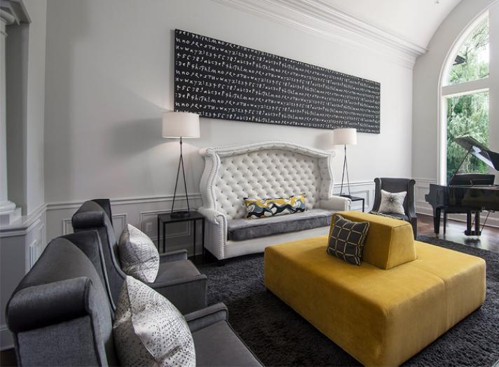
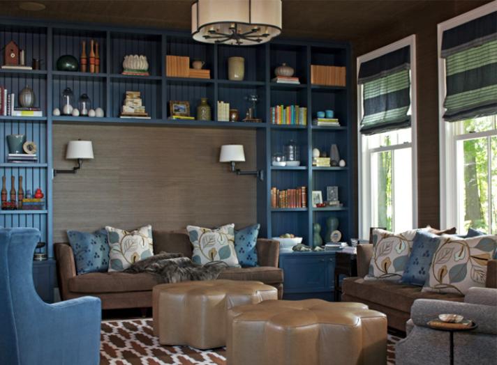
“The design concept in the great room featuring the gold ottoman was 'Seamless Style.' The architecture in the house was quite traditional, but when the clients moved in they wanted the look to be more transitional. One way we accomplished this was by painting all the dark woodwork in the house white to blend seamlessly with the walls and ceiling. We mixed complementing traditional with sleek-lined pieces to help change this once-dated room into a space the client was proud to show off. Overall, the house had a color palette that was quite neutral. Pops of citron gold were intentionally placed throughout the large social spaces in the house to create interest and eye movement. The traditional Moroccan motif on the rug mixes well with modern fabrics in the living room featuring blue painted built-in shelving. The horizontal lines on the Roman shades and the clean lines of the settee style sofas, combine effortlessly with the star-shaped ottomans in an up-to-date faux leather. The raised leaf pattern on the pillows and the grass cloth on the walls give this room an earthy feel with a current bold color palette.” – Jill Schumacher and Michelle Mio, Rariden Schumacher Mio
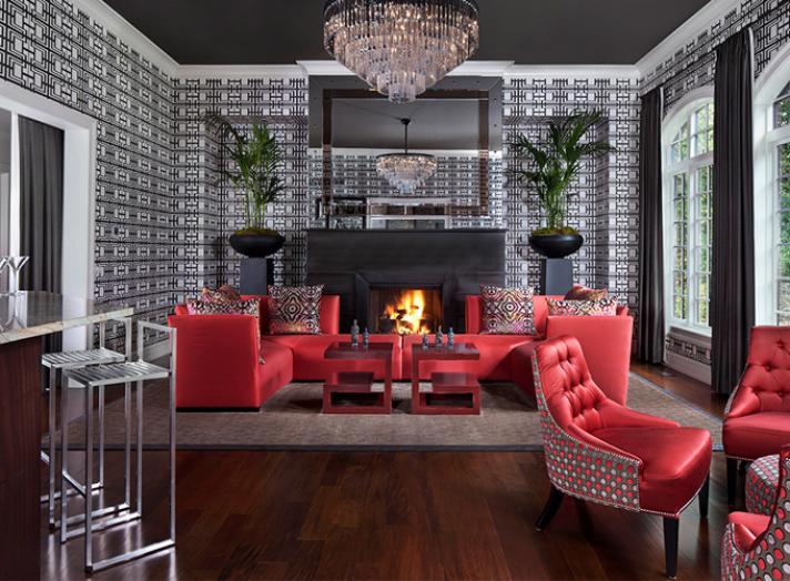
“With bold strokes of pattern and color, the great room above is a celebration of the mix! Classical elements, such as the iconic Greek key, mix well with the multi-tiered crystal chandelier, the colorful damask pillow fabric, and the whimsical dotted upholstery and oversized planted palms. They recall themes found in the tropics, as well as stately Art Deco interiors. The underlying theme is classical, but the interpretation is modern.
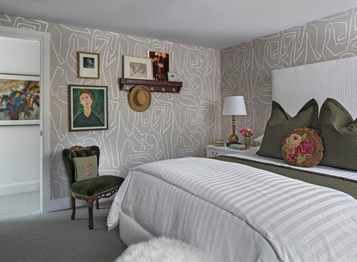
I believe what ties the bedroom above together is a common thread that all the furniture and accessories share. Everything seems as though it has been touched, or created by, human hands, possibly female hands. There’s a certain nostalgia and comfort with this mix of genres. The dark green, grey, and white color combination is refreshing, and anchors the design intention nicely.” – Amy Miller Weinstein, AMW Design Studio
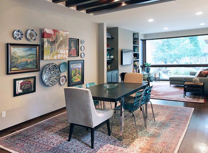
“We were hired by one of our clients because of our reputation for working with existing pieces to achieve an eclectic mix. They love mid-century modern and tasked us with how to combine that style with some existing folk art, some family heirlooms, and some recently purchased contemporary art. The client already owned the two traditional rugs. She specified a new mid-century style sectional and did an eclectic art mix on the main wall, making the mix of styles front and center. The older pieces really pop against the modern lines of the house and the bright pops of colors.
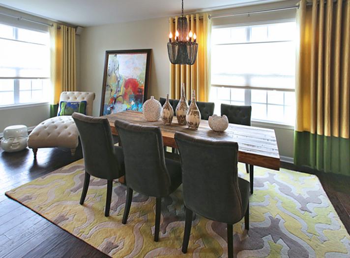
Another client asked for a distinctive and fun approach to their new home. We combined vibrant colors with rustic surfaces and pieces that mixed multiple styles, sometimes even combined in one piece. The chandelier has a very traditional style, but the fact that it is all black chain makes it modern. The painting is a traditional equestrian, but the abstract treatment and colors make it feel more playful. The dramatic scale and the fact that we chose to lean the piece make it feel very unexpected in the space. Also, the client loved the pairing of the tufted chaise, which is very traditional, with the playful Buddha occasional table.
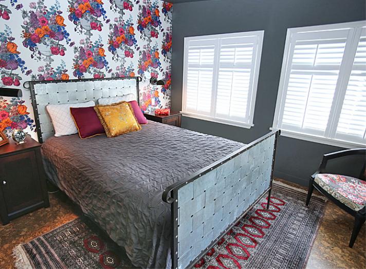
Another client wanted a dramatic and powerful bedroom, despite the small size of the space. Our client wanted a mix of masculine and feminine and unexpected fun. It all started with a Clarke & Clarke wallpaper from Duralee, a traditional subject matter done in an unexpected palette. Our client loved the playful wallpaper as a backdrop for the iron bed and the industrial light sconces. We combined a traditional rug and a cork floor in warm caramel tones. The dark grey walls and crisp white shutters make a well-grounded backdrop for all the pops of colors. We took a small-scale vintage chair and gave it new life with this playful fabric found at Tennant & Associates by Jim Thompson Fabrics. Pillow fabrics are from Robert Allen." – Dan Davis, Dan Davis Design
