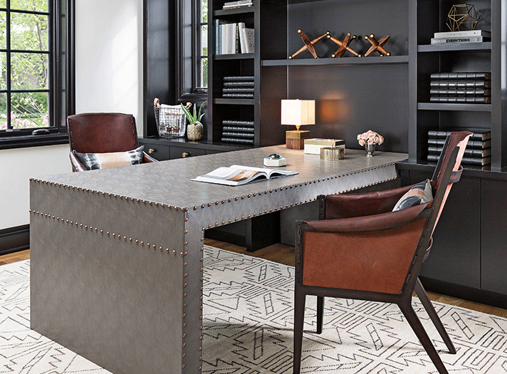
These days, more people are working from home, at least some of the time, and many students are dividing their time between in-person and online classes. Three top designers share their advice on how to make work/study areas clean and functional without surrendering beauty and warmth, an example being this home office designed by Dayna Flory Rasschaert.
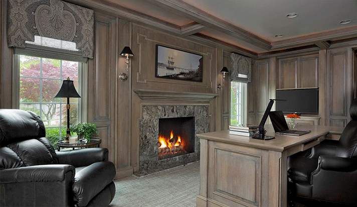
A work area at home can also be cozy, as Ann-Marie Anton’s design proves. Photo by Beth Singer
TO ANN-MARIE ANTON, PRINCIPAL OF GROSSE POINTE WOODS-BASED IT’S PERSONAL DESIGN, a study/work area can be both beautiful and functional. She describes the evolution of this comfortable work space, from conception to completion.
“Start by creating a list of objectives for your room, what your storage and work space needs are, set your budget, and then create your environment around it in the most way efficient way possible.
“In the home office above, our goal was to create a beautiful yet very functional space. To accomplish this, we created a custom U-shaped desk space that allows the homeowner more counter/work space. We also had a whole wall of custom storage and file cabinets built so they seamlessly flow in the room. We wanted the room, when not in use, to be very clean yet cozy because the room is right off the foyer and the user spends a lot of time there reading. In order to keep the room clear of clutter, we had the custom desk built with the computer on a lift, so when it is not in use it drops below the desktop. The same holds true for the television, which can be hidden in the custom cabinet.
“Although we had a relatively low ceiling height, we wanted to add warmth and interest, so we installed molding with up-lighting that ties into the wall paneling.
“Our overall goal was to create a cohesive, beautiful space that flowed into the rest of the house but still functioned efficiently.”
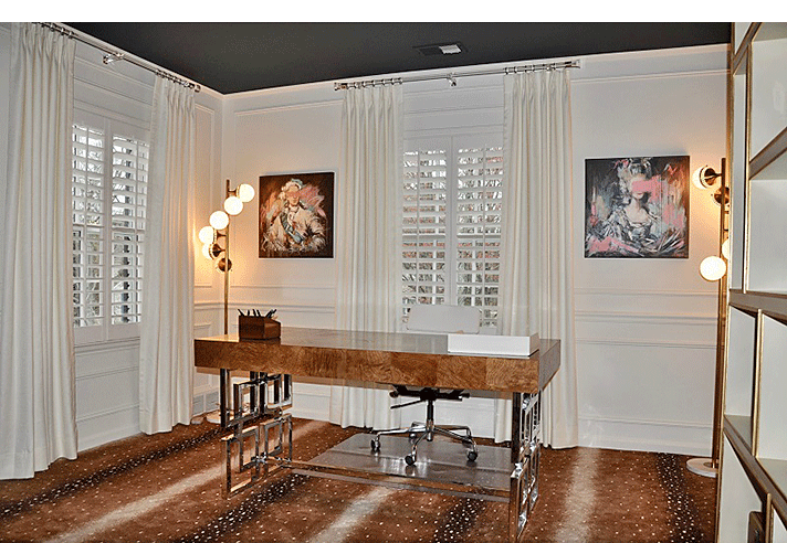
Sophisticated but minimalist design allows Annie Kordas to be productive at home. Photo by Mark Reinholz Photography
THE ABOVE PHOTO IS THE HOME OFFICE OF ANNIE KORDAS, PRINCIPAL OF GROSSE POINTE-BASED ANNIE KORDAS INTERIORS. She explains her approach regarding how she made the space sophisticated but functional.
“My home office was designed with beauty and sophistication in mind. I added moldings and painted the walls a soothing off-white color (Benjamin Moore Swiss Coffee). My color palette is light and neutral with heavy use of whites, creams, tans, and browns. To showcase the beautiful Visual Comfort light fixture, the ceiling was done in an unconventional dark green color (Benjamin Moore Regent Green).
“The space is moderately furnished with a spacious desk by Bernhardt, a decorative file cabinet, two small accent chairs, and an asymmetrical bookcase featuring items ranging from vintage cameras to antique radios. Mixed metals punctuate the modern vibe.
“The walls are painted light to allow for an energizing effect. Darker walls may have made the space feel too cozy, hindering productivity. In addition to the more decorative ceiling light, I added two Jonathan Adler lamps that produce a nice amount of light and illuminate the commissioned paintings of Louis XVI and Marie Antoinette by artist Mandy Racine.
“This second-floor bedroom converted to an office has white chameleon-like drapes to complement the energizing off- white walls. The closet houses the wireless printer, office supplies, and bins to accommodate fabric and wallpaper memos."
The clean, uncluttered design aesthetic has maximum benefits for Annie. As she says: “Clean lines and minimalist décor allow for a soothing work experience every day.”
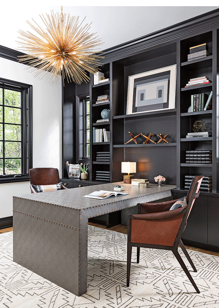
A partner’s desk is ideal for organizing and displaying, Dayna Flory Rasschaert says. Photo by Martin Vecchio
DAYNA FLORY RASSCHAERT, PRINCIPAL OF BLOOMFIELD HILLS-BASED DAYNA FLORY INTERIORS, has specific ideas of what constitutes a well-functioning work/study space. To her, organization is everything, but she also suggests adding accessories to add warmth and interest to the area.
“An oversized desk is best,” she explains. "I prefer a dining table or partner’s desk (as shown in the above photo) if space allows. Having a large horizontal space is perfect for organizing paperwork. Because I work in the creative field, it also helps to lay out the visual aspects of my work: textiles, tear sheets of furniture, wallpaper, etc.
“For me, keeping the color palette neutral in black and white tones, as well as ivory and taupe, helps reduce visual clutter. Interior designers’ spaces are full of fabrics and paperwork, so try to stick to the less is more principle.
“I like keeping everything in white grass cloth boxes. I also love a label maker. Each box holds office supplies. The labels look tidy and help locate items quickly.
“Make sure to accessorize your home office just as you would any other room in your house. Use a great accent rug, wallpaper it, incorporate art, and don’t forget to take a few of your bookcase shelves and accessorize them with pretty things, not just office supplies. I think adding special design touches to your home office makes all the difference.
“I always like layering light – can lights paired with incandescent ceiling lights and, of course, great lamps. This way you can adjust the light with the time of day and type of work to set the perfect mood.”
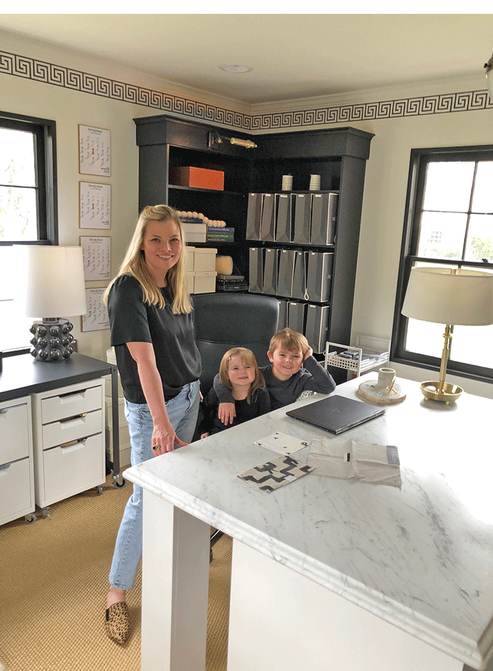
Dayna in her work/study space at home with children Piper, 2, and Oliver, 6.
