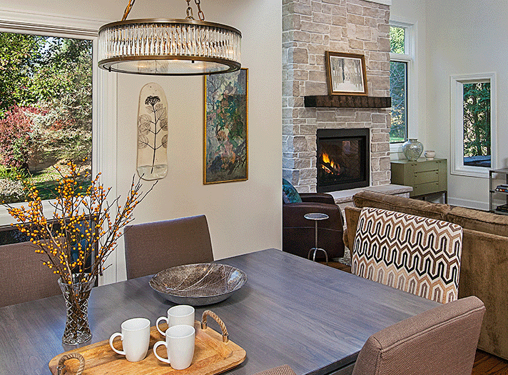
As another calendar year turns the page, it’s time to start off on a fresh foot. That includes design, where a streamlined simplicity is the goal, such as this space designed by Laura Zender. Careful editing will reduce clutter, and rearranging items can create an invigorated look. A fresh décor can sometimes have the added benefit of clearing our minds. Whether they’re starting from scratch or refreshing a current space, professional designers offer their advice on editing a space.
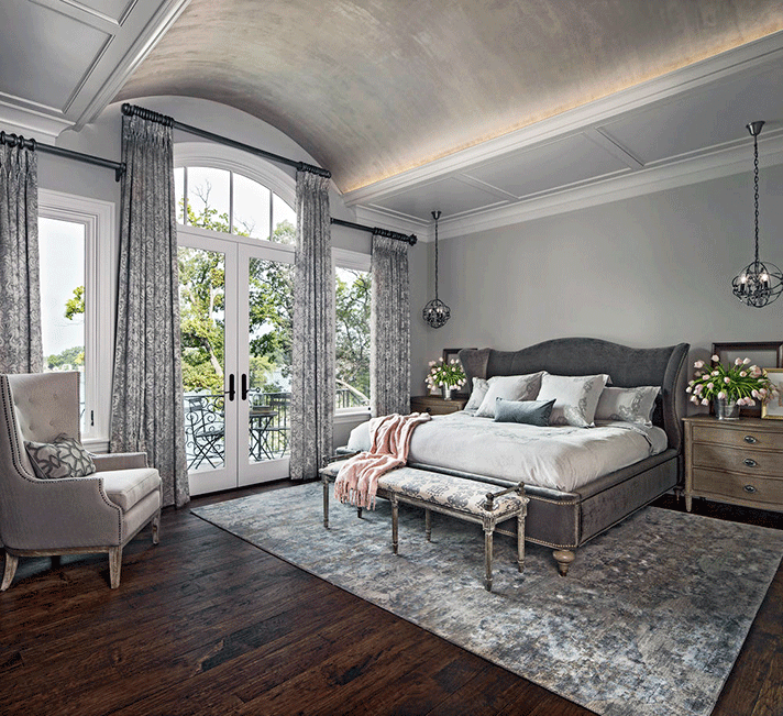
Amanda Sinistaj designed this well-edited but warm master bedroom. Photo by Beth Singer
Amanda Sinistaj, principal of Birmingham-based Ellwood Interiors, creates an edited look by using forethought. “Too many ideas usually show up as too many ideas. Pick your two or three favorites and coordinate them so they work nicely together.” Amanda also suggests “having a focal point and try not to distract from it.” Textures and layering can add to a clean but warm look. She advises mixing sheens and textures, “but use the same tones of color for a more minimal and subtle look. If you are layering bold colors, make sure there is an underlying cohesive vibe so they all still work together.”
When she’s working with a client who goes overboard with accessories, such as family photos, Amanda advises whittling the collection down so it has meaning. “Too many family photos create clutter, which detract from the beautiful memory the photograph itself represents.”
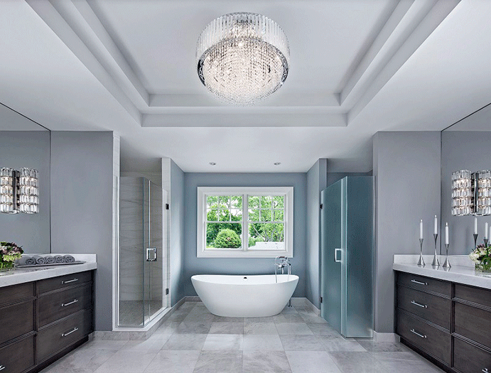
This streamlined bath by Katie Rodriguez harmonizes effortlessly in surfaces, color, and lighting. Photo by Beth Singer
To Katie Rodriguez, owner of Birmingham-based Katie Rodriguez Design, “A space is like music. You want it all to harmonize. It should have high and low notes, but the underlying theme is consistent.” To that end, she believes that the best spaces are “edited reflections of the homeowners.” It’s important to include meaningful items, she says, but not every tchotchke needs to be on display. “I recommend starting with the most important items (a favorite artwork, an heirloom, etc.), and build around that. Consider scale, pattern, and color as you fill in, and be careful not to crowd items.”
Pattern and color schemes also play important roles in avoiding a cluttered appearance. Katie recommends a restrained palette so accessories can accentuate the space. She also suggests employing a range of patterns in the same space. “Pair large and small prints and patterns so they do not compete with each other. The same holds true in terms of sheen. Pairing matte and shiny finishes will be more pleasing to the eye.”
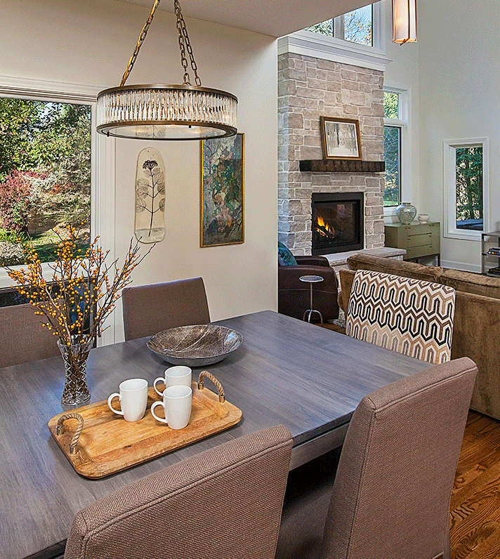
Laura Zender says using existing artwork and sofa dictated the neutral palette and transitional style. Photo by Jeff Garland
For Laura Zender, principal of Ann Arbor’s Laura Zender Design, creating an edited space for clients is a process. To begin with, “Sentimental value trumps all,” she says. “We can always find a spot for the most beloved items, regardless of size, value, or provenance.” The next step is defining items that will fit the overall design scheme by asking: “Do they meet a particular function for the room, are they one of a kind, do they fit into our defined color palette?”
Then the real work begins. “Once we’ve identified the best of the pre-owned items, the ‘big edit’ occurs. We gently suggest that not all items have to be out at one time; they can be rotated in and out over time. We try to work within a predefined color palette when choosing items that will stay, particularly where to place existing artwork.” To complete the picture, Laura and her team purchase new pieces that complement existing ones in style, color, or scale.
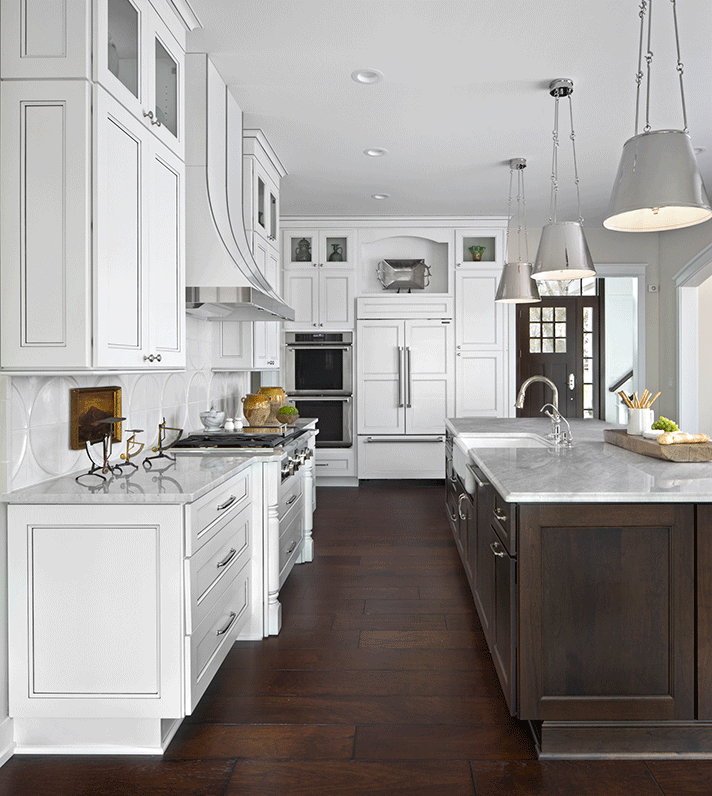
Marianne Jones used wood panels on the refrigerator that match the cabinetry for a clean look. Photo by Beth Singer
Before creating a well-edited space, Marianne Jones, principal of the Birmingham firm Marianne Jones LLC, sticks to a mantra: “Keep it simple.” That way, the urge to over-accessorize will be held in check. Marianne suggests starting with a “good space plan with your seating or dining areas and using upholstered pieces of textured neutrals.” Her other advice includes:
- Use clean, fresh paint colors (quiet neutrals).
- Let your original artwork be your focal point. Art should be personal, textural, and interesting with a strong depth of color or pattern. Light the artwork where possible.
- Add textured or patterned rugs for interest.
- Don’t forget to light your space with soft, ambient lighting.
- Use fabrics of diverse and layered textures; for instance, linen, leather, nubby wools, or bouclés.
Editing a space too severely could have the result of looking too clinical, so Marianne closes with some helpful pointers: “I love layering wood pieces into a room, whether it be a turned container or an antique table, she says. “I also love one-of-a kind forms for added interest – for example turned ceramic pieces or pottery in a grouping.”
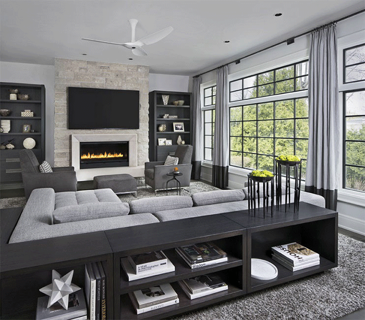
The clean design in this space by Amy Miller Weinstein is a fine example of a well-edited room. Photo by Beth Singer
Amy Miller Weinstein, owner of AMW Design Studio in Birmingham, says starting from scratch to achieve an edited look is ideal, but if it’s a space with existing furniture, “sometimes a new arrangement or a subtle tweak can have a big impact. My motto is: ‘Inches matter!’
“Remove all accessories, plants, pillows, art, and evaluate. Be intentional about what goes out. If it’s not adding to the vibe of the space, eliminate it.”
Amy says the most common mistake clients make is having too many small objects. “Go with bigger pieces and fewer of them. Strive for visual impact and harmonious relationships with respect to shape, color, texture, and size.” She also cautions against rugs that are too small for a room. “They’ll chop up the entire effect of a pulled-together room.”
Her approach to starting with an empty room begins with scale. “That’s critical! Too many small furnishings and objects look messy, cluttered, and random. The goal is to create visual focal points with fewer pieces.”
In general, Amy suggests every comfortable room needs the following:
- Area rug
- Pillows with down filling
- Books (A few chunky ones are always good!)
- Something fresh or organic
- Soft window treatments
- Light dimmers
- Artwork
- Throw blankets
