One of the joys as we travel through life is collecting special objects that speak to us, such as a piece of art or sculpture found on an exotic holiday. But perhaps later, you struggle to find the right place for it in your home. Or maybe your house is more traditional, and you want to mix in some contemporary pieces, but you’re unsure how to go about it. We’ve asked four experts to show how to marry different interior design styles to create an integrated space.

Photography by Beth Singer
CONTEMPORARY FRENCH COTTAGE
“This client isn’t a big fan of ordinary drywall, so we made a special effort to elevate this French Cottage-style home by adding striking millwork and beams that brought warmth throughout. In this bedroom, we selected a curated mix of modern, antique, vintage, and organic elements to give it a balanced and cohesive appearance. I think layering all these styles makes the space more interesting. We took ornate pieces like the English bench at the end of the bed – with its worn leather seat and turned legs – and paired that with the simple poster bed with neutral fabrics. You want your big pieces, like the bed, to have a feeling of simplicity so that you don’t get tired of them over time. Everything in this room is very purposeful.” – Marianne Jones, Marianne Jones
MARIANNE’S TIPS:
- Pay attention to form. I like the interplay of contemporary items with antiques. You don’t want two ornate objects next to one another. For example, I love the simplicity of the little picture placed near the chest; I think it’s about the positioning of things, and interplay between the lamp, chest, and artwork. Think of all the pieces as a group.
- If there is a piece that is precious or speaks to you, then there’s a place for it in your home. You want things in your space that are curated and considered without being overdone. You aren’t just filling up a space, there’s intention behind it.

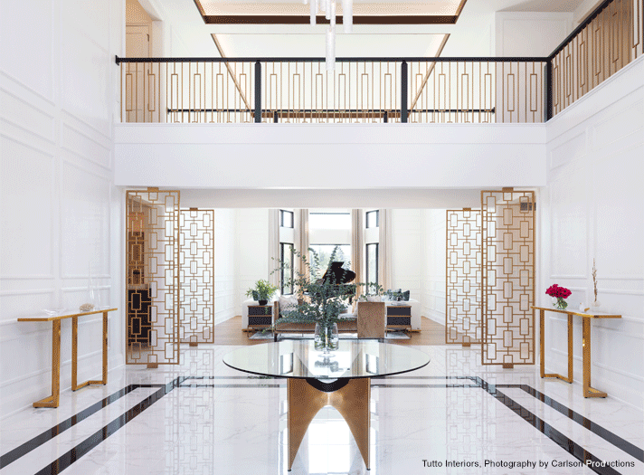
Photography by Carlson Productions
MODERN ART DECO
“Our conceptual plan turned into a reality when we proposed the millwork for this client's main entrance, living room, and hallway. Upon entering, visitors are greeted by a stunning two-story foyer with a majestic Art-Deco inspired staircase and soft gold metal panel dividers that have a sophisticated air. The eye is drawn aloft to the ceiling that is laced with indirect sunlight and a 60-inch custom crystal chandelier. Below, white porcelain tile with a black border adds a bold statement. The architectural framework is just enough to add a modern backdrop without becoming the main feature.” – Cheryl Nestro, Tutto Interiors
CHERYL’S TIPS:
- When mixing design styles, I think it’s important to have a connection between styles that can be translated through the finish, a textile, a light fixture, or a wood material.
- Most importantly, I believe the right backdrop on a wall can bring many styles together. In this home the white backdrop brings everything together.

Photography by Beth Singer
IN THE MIX
“When designing this space, we wanted to respect the home’s Victorian architecture, but the growing family required a casual space that was capable of extra seating and was multifunctional. Some of the pieces that harken back to a Victorian style include recessed cabinetry, seeded glass, soapstone countertops, and a farmhouse sink. Then, we added a modern twist with the marble mosaic herringbone backsplash, quartz island, and clean-lined furniture and lighting. The island’s unexpected Scandinavian modern walnut molded counter stools bring additional seating in a limited workspace. The expandable wood and metal dining table – paired with Philippe Stark mid-century modern white stackable chairs – clean up easily and are suitable for outdoor use on their lakefront veranda. A punch of color from modern art and a sculptural sparkle from the bubble glass chandelier complete the modern finishing touches.” – Margaret Skinner, Margeaux Interiors
MARGARET’S TIPS:
- One misconception people have is that styles must match. Wipe that “everything must match” or even the word “match” out of your vocabulary. A match is for a candle.
- Another misconception is that there are rules. Well, yes and no. The balance of color, pattern, and scale can make different styles work together beautifully.
- Design trends are ever changing and ever evolving. An instant way to add life to a space that is showing a passing trend is mixing in a few pieces that are more contemporary.
- The dining room is a great place to start mixing styles. For example, a classic Chippendale mahogany dining table could take an unexpected modern and less formal direction with clean-lined white Saarinen Tulip-based chairs. Also, the reverse of that, a modern tulip-based dining table mixed with Chippendale-style chairs can add a cozy warmth. Each example creates a classic style.

Photography by Beth Singer
NEOCLASSICAL MEETS MID-CENTURY MODERN
“This tranquil sitting room combines Neoclassical styling with mid-century pieces. The etagere echoes the design elements of the Neoclassical period with its simple lines in addition to the Roman column detail and the X-braces on the sides and top. The mid-century modern Vladimir Kagan curved sofa echoes Art Deco styling, and the mossy-green color palette unites the look.” – Linda Shears, Linda Shears Design
LINDA’S TIPS:
- I think it’s important to have unifying elements when mixing design styles. For example, limit your color palette and extend it throughout the space.
- Repeating design details creates balance in a room. In this vignette, brass elements stroll through the room via gold leaf accents that can be seen at the top of the columns of the etagere, the accessories, the metal base of the cocktail table, the chandelier, and the hammered brass base of the console table.
