While neutrals have a definite role in decorating, it is a refreshing change to see spaces that effectively use vivid colors. Whether through repeating vibrant colors from a painting throughout a space or incorporating a daring color scheme, when done correctly, unusual color combinations can make a stylish statement. From intense yellow to eggplant purple, several top designers share how they integrated color in striking ways.
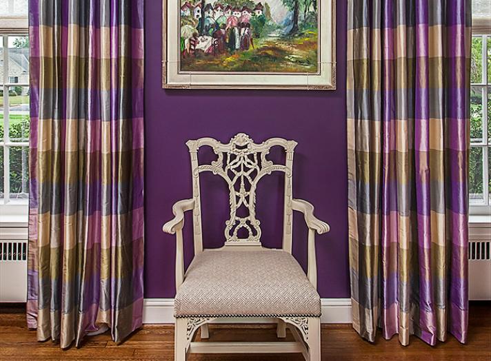
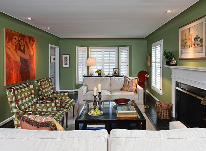
“In both rooms the artwork inspired the vibrant wall colors. In the first instance, the eggplant walls provide a great background for the beautiful painting by Carla Mazzucato. The drapery fabric from Robert Allen, chair from Hickory Chair, and Conrad shades all employ a similar color palette to match the painting. In the family room, an inherited art collection inspired the rich shade of dark green that is a perfect background for the art.” – Gail Urso, Urso Designs
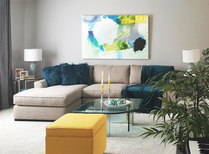
“About five years ago gray became the on-trend neutral color for interiors. From the cooler grays to the warmer greige tones, and the 500 shades in between, it is still a very popular neutral. Unlike beiges, which die as a backdrop for colors (especially the popular clean colors), grays really help colors pop. My client purchased a home that was very beige, and locked in the 1980’s. She is a young and perky individual who favors the cooler blue-grays and loves teal as an accent color. We cocooned the living room in grays – changing the carpet to a platinum grey, painting the walls Sherwin-Williams 7672 Knitting Needles and lightened the window treatments to white under-curtains with gray faux silk side panels. We brought the gray room to life by placing her favorite color teal on two lounge chairs, (not seen in the photo) accent pillows, and a throw. But the room still needed the spark of an exciting warm color. An obvious choice would have been teal’s complementary color, which is coral. But when we found the canvas which now hangs above the sofa, it set us on a path to use intense yellow as our missing element. In accessories and small scaled furnishings, the strong yellow creates a color path that leads the eye across the room via a method called color mapping and adds to the allure of the space.” – Linda Shears, Linda Shears Designs
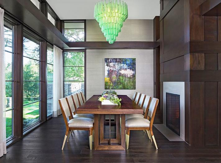
“My client was searching for something unique in this dining room. Her point of reference in the past had been a more traditional aesthetic so moving into a modern prairie-style home with clean lines was a change. When she found this vintage Murano Glass chandelier, I was totally on board. She still wanted 'pretty' so this was a great way to add a punch of color into the home. It has a nice modern quality as well. By the way, her favorite color is green!
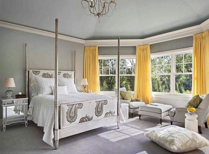
In the young girl’s bedroom, the parent wanted to make sure it carried through to teenager and adult years. Backgrounds were kept to a sophisticated gray palette. The paisley on the bed from Schumacher was our starting point with its pale gray, pale blue, and yellow embroidery stitch work. We used the pale blue (In Your Eyes from Benjamin Moore) on the ceiling to create the 'sky'. It was the natural decision to frame the window in bright yellow silk from Schumacher as it frames the window perfectly bringing the outside into the room. Additionally, the draperies were mounted on the front edge of crown to hide the automated shades hidden behind.” – Ian Hartwell, Oliver Max Inc.
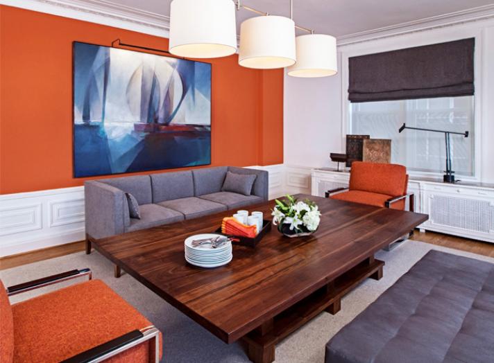
“Popular opinion suggests that art should be viewed on a neutral, or many times, a museum white background. I hold the opinion that sometimes the colors selected by the artist may dictate the best background, or wall color to enjoy the piece. This was the case of selecting the backdrop color for the work of local artist, James Kristich, in this apartment dining room overlooking the Detroit River.
However, the obvious wall color of blue would have swallowed up this canvas, so we pulled out the unexpected vivid orange from the boats in this piece, thereby maximizing the beauty and energy of the blue tones in the image. Per the residents, it has clearly been an unexpected (and successful) color choice for those who have enjoyed the art and the room.” – Kathleen McGovern, Kathleen McGovern Studio of Interior Design
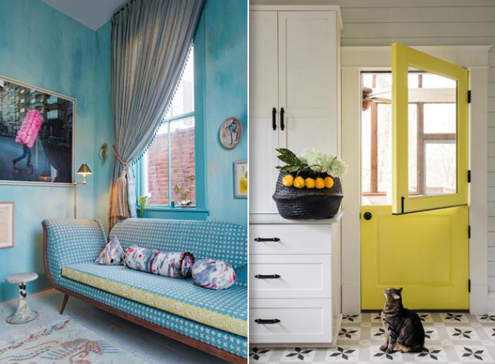
“For the turquoise space above, we sought inspiration from the beatnik musings of the Bloomsbury Set – a group of English artists, intellectuals, philosophers and writers who worked and studied together near Bloomsbury, London in the first half of the 20th century, and whose bohemian ways greatly influenced the aesthetics of their time and beyond. Lounge-like, a bit rumpled, far less than perfect – this space is meant to be an artist's retreat. A place to bask in the morning light with time to enjoy the simple pleasures of one's coffee, the art that surrounds, and to take the time to contemplate.
While we sought to keep the design in the kitchen pictured above focused on a minimalistic color palette of blacks, whites, and grays, that can get boring fast. To counteract the simplicity of the space, we chose to give the door to the screen porch a splash of vibrant yellow which speaks to the colorful personality of the homeowner.” – Krista Nye Nicholas and Tami Ramsay, CLOTH & KIND
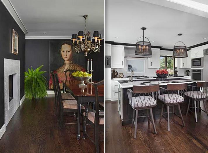
“Black and white each represent an extreme that is a must in design. In the home above, black is taken to the extreme in the dining room. Black gives objects perfect form, and color shows amazingly well as you can see from the portrait on the back wall and the custom white tile surround on the fireplace. Using the ebony paint in the entire room makes a powerful and striking statement. To accentuate the compelling dining room theme, the black is represented throughout the home via the use of window trim, crown molding, quartz kitchen counters (a mixture of black and white) as well complementing accessories while blending spectacularly with the white walls and cabinets in the kitchen.” – Rita O’Brien, Rita O’Brien Design Group
