In interior design, size does matter. Just because a piece can be squeezed into a space doesn’t mean that it belongs there. Scale and proportion are paramount. Furniture, lighting, art, and accessories and how they work in relationship with one another need to be carefully considered, as design firm RL Concetti has done in this image. Three design pros weigh in with their expert advice on attaining proper scale and proportion.

In this room by Serba Interiors, the large art adds movement without overwhelming the space. Photo by Justin Maconochie
DESIGNERS KEVIN SERBA AND JOHN RATTRAY, OF BIRMINGHAM-BASED SERBA INTERIORS, say achieving proper scale and proportion is a balancing act. They advise not only to consider furnishings in relation to scale, but architectural elements as well.
“One of the most important design principles to employ when planning your space is the balance of scale and proportion both in architecture as well as interior furnishings. It is also important to identify the impact you are hoping to achieve with these elements within each space.
“Smaller rooms with lower ceilings, such as a guest bedroom or sitting room, may benefit from minimal architectural moldings and furniture that mimic the scale of the space. On the contrary, a smaller room, a study or den, for example, can be made cozier by the addition of stronger architectural elements such as dark wall paneling and oversized furniture that fills the space.”
More spacious rooms present their own challenges to achieve balance, they say, but there are some solutions.
“If a room is large, one might balance the scale of the room with a wall of architectural interest, such as a fireplace wall or the addition of a large built-in. Larger rooms can also be balanced by arranging the furniture to create multiple groupings within the space, rather than one large central seating arrangement.”
The scale of the artwork in a room should also be a factor.
“In the living room shown above, you can see that the art by Cathy Daley adds movement and contrast in a room with white walls and neutral upholstery pieces. The artwork fits well within the room without overwhelming the space. Not shown is the paneled fireplace wall opposite the sofa, another consideration when choosing this large-scale piece of art for the room.”

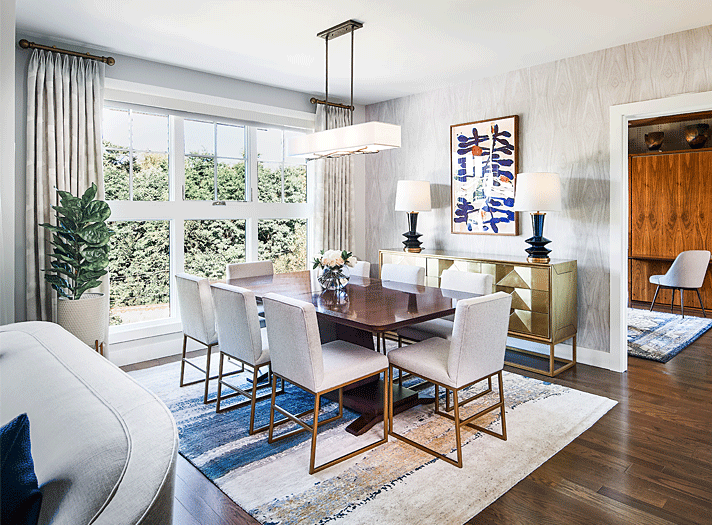
Scale and proportion were top of mind for RL Concetti when designing this Ann Arbor condo. Photo by Kristopher Ilich

In this shot, the lamps were chosen based on the height of the art and width of the credenza. Photo by Kristopher Ilich
FOR CLIENTS WHO WERE DOWNSIZING TO A NEW CONDO IN ANN ARBOR but still wanted the flexibility to entertain, owner Rachel Nelson and her team at Detroit-based RL Concetti focused on scale and proportion in a project they fondly call #JustUs2inA2.
“Scale refers to how well pieces fit in your space, while proportion refers to how well those pieces fit together. This dining room (above) is the perfect example to explore both design principles.
“Selecting a dining table is an exercise in scale. First you must know the size of your space. A table should have 36" - 48" of space between the table and the wall. Additionally, each guest at the table should have 24" - 26" of space between each chair. These dimension constraints will reveal the perfect size table for your room.
“The right rug will anchor your space and provide yet another opportunity to emphasize the intended design aesthetic of your space. Choosing a rug is about proportion, as the size is best determined by the size of the dining room table. A good rule of thumb is that your rug should be 24" larger than your table to ensure guests are able to fully pull out their chairs while keeping them comfortably on the rug.
“Dining chairs are another example of crucial proportions. You have to consider the width of the chairs in relation to the width of the table, the height of the chair backs, and the height of the seat in relation to the height of the table. In #JustUs2inA2, we found it best to have these chairs custom-fabricated to ensure we got these proportions just right.
In good design, negative space has an important role.
“When selecting the credenza and artwork, it was important to consider the scale in relation to the room’s ceiling height. Both the art and the credenza are each about 1/3 the height of the room, leaving 1/3 of negative space. Negative space allows room for your eyes to focus on the important design elements and prevents a space from seeming too cluttered.
“Finally, when selecting the accent lamps, we considered the proportional relationship to both the width of the credenza and the height of the artwork. Each lamp sits on either side of the artwork and slightly within the ends of the credenza. The lamps land roughly halfway up the artwork, which is another familiar proportion for the observer to experience."

Katie Rodriguez chose long drawers instead of choppy doors for these his-and-her vanities. Photo by Beth Singer
KATIE RODRIGUEZ, PRINCIPAL OF KATIE RODRIGUEZ DESIGN IN BIRMINGHAM, says repetition, shape, and “breathing space” should be weighed when addressing scale and proportion. She discusses her approach in two rooms, a master bathroom and a living room:
MASTER BATHROOM:
In the above image, we are balancing long his-and-her vanities. We considered the vanity design, with longer drawers to accentuate the length. Had we done a series of doors (instead of drawers), it would have felt choppy. Consider repetition and shape, along with proportion. Too many shapes and interruptions can make a piece feel out of scale.
- The sconces we chose were larger and dense to accommodate the open space we had with the flush wall-to-wall mirror. When making bathroom sconce selections, I suggest you think forward as to what the mirror will be. There should be a balance whether you have a decorative mirror or not. If the mirror is large and encompassing, you may want to consider a smaller sconce to complement it.
- The tub also had to have a decent scale to it, to fill up the nook. Equally important is to allow for some breathing room. This holds true for any object, be it furniture, bathtubs, etc. that can be “boxed in.” I like a “full” feeling, while keeping some breathing room so the object doesn’t seem squished into the space.
- When selecting lighting, I consider the size (length/width) of the room, of course, but don’t forget to think of the height. The larger the void, the bigger the fixture can be.
LIVING ROOM:
The living room (below) was a renovation project, and we didn’t have the luxury of tall ceilings. We omitted crown molding and did a simple step detail in the ceiling that I think draws your eye upwards and adds detail without seeming to squash the room.
- The fireplace design is also fairly minimal. We left some space on either side of the mantel, so as not to make the space feel crowded.
- The sofas are a low profile to keep the space feeling light. And speaking of light, we added lots of natural light with new windows. We considered placement and proportion with the fireplace being centered between the two windows. The fireplace wall is only slightly larger than the windows on either side.
- When choosing a rug, I like to go just outside the furniture setting to ground the space. If there is not a standard size available that works, I will often modify a rug, or find a nice broadloom to create a rug that’s exactly the size I want.

The fireplace, windows, and low-profile furniture work in harmony in this Katie Rodriguez project. Photo by Martin Vecchio